This is an article I wrote a few years ago. Sadly, it is still relevant today.
————-
Bad PowerPoint is all around us. It can be found in board rooms, class rooms, and conferences all across America. It is so prevalent, that when I say “Death by PowerPoint,” everyone knows exactly what I’m talking about.
 So why is that? How did we get here? How did we arrive at a point where droning through bulleted lists became not just acceptable, but the norm?
I believe the two main culprits are lack of training and lack of time.
The vast majority of the presentations you see were created by someone with no real training in the area of design. They have probably been trained how to use PowerPoint, though even that isn’t a sure thing. But knowing how to use PowerPoint and knowing how to use it effectively are two completely different things. It’s like teaching someone how a car works, but not teaching them how to drive or explaining any traffic laws.
And design is a skill, like any other. I work with IT consultants every day. Smart people. Actually, freakishly smart people who know more about computers than people should really know. They have a very specialized knowledge-base and skills that make them the right people to go to if you need a network designed (for example). I wouldn’t tell them how to design a network because I don’t know enough about it. I’m vaguely aware of how a network functions (through a series of tubes?), but they have the right training and expertise. They are the right people for the job.
Design works the same way. It is a discipline with a well researched knowledge-base. People don’t think of it in those terms, because there is an artistic element and we are drilled that any artistic voice is valid. Yes, there is a creative element. But there are rules behind solid design, and unless you know them it’s hard to know what works and what doesn’t work
Another reason presentations are bad is that we don’t give them nearly enough time. Good presentations – really good presentations that make an impact – take more time than you probably think. A good presentation needs to be planned out start to finish. It needs to be sticky-noted, whiteboarded, and thought through from an audience’s perspective. And that’s before one pixel is built. Because we don’t have time, the tendency is to throw ideas on the page. Because there is no time to consider how to best do this, the ideas get bulleted. Graphics are limited to what’s on hand, and often intended to “spruce up” a page that already has too much text on it.
And that is how we get Death by PowerPoint.
If you really want to avoid Death by PowerPoint, you will not give in to the standard paradigm. You won’t look at PowerPoint as a tool to create lists. You will give your presentations more time. Above all, you will consider the best way to convey your ideas to your audience.
Here are some principles that I think all presenters should consider. They aren’t comprehensive, but they are a good start.
Brevity
I could go on and on (and on) discussing brevity. “Less is more,” is a well-worn cliche, but it is at the heart of all good slide presentations. When it comes to slide content, you should question everything you put on the screen. Every word and every image should serve to convey your idea. If it doesn’t help you convey your idea, remove it because it’s clutter. Keep your diagrams simple, your images direct, and your words few. Your presentations will be better for it, and your audience will be grateful.
One Idea per Slide
I’m not big on rules, but I’m a firm believer that you never want to convey more than one idea per slide. That’s because all people, even world-class multi-taskers, can only fully attend to one thing at a time. If you give each idea its own space, you are giving your audience their best chance at understanding your point. If an idea is important enough to present to your audience, it deserves its own space. So give each idea its own place in the projector. After all, slides are free.
What’s the Big Idea?
I don’t want to break anyone’s heart, but your audience will not remember everything in your presentation. With that in mind, you need to pay close attention to your “big ideas”. What do you want your audience to remember a week from now? These are the ideas that should be the focal point of your presentation. Be sure to present them in a way that shines light on them. Make them memorable. Repeat them. Build your presentation in a way that gives them focus.
Bringing enough focus to your key points can be a big differentiator, because most presentations I see are relatively flat. They convey loads of information, but they don’t do a good job illuminating their key takeaways. And make no mistake, it’s your big ideas that people are after. Don’t disappoint them. Put a spotlight on your big ideas.
The Glance Medium
Slides are an important aspect of most presentations, but not in the way most people think. That is, a slide shouldn’t be the star of the show. It’s a supporting role. If your audience spends too much of their mental energy reading or examining your slide, they probably aren’t spending enough time listening to you. Therefore, think of each slide as something to be glanced at that supports your point in some way. Unless you’re walking through the information on screen, then the content on the slide should convey its meaning in just a few seconds. The rest of their time, they should be listening to you.
Sans Cheese
You’re a pro, so stay away from cheesy things that makes you look like an amateur. That means avoiding clipart, transitions, and animation. These things can all be used well, but probably 99% of the time they are not. Clipart screams “unprofessional” from the top of the hills. Better to either use a good photo or no images at all. Transitions and animation are most often used to dazzle audiences, but it’s normally distracting. If you use animation to help highlight your point, that’s fine. Otherwise, leave the tricks at home. They look cheesy.
Take Care
Be careful and deliberate about where you place things on a slide. Items that are poorly aligned or clash with the rest of your presentation will stand out to your audience as carelessness. This is a grave error, because you want your audience to understand that you value them and their time, certainly enough to make sure fonts are consistent, text lines up, and elements are displayed where they should.
Be a Student
If you want to be a good presenter, you need to study. Read the best books on the subject. I routinely recommend the works of Nancy Duarte (slide:ology) and Garr Reynolds (Presentation Zen) because I believe they are the best minds in the field of presentation design. Broadly speaking, I would avoid books that focus on “how to use PowerPoint.” These books tend to focus on what PowerPoint can do and focus very little on design. And a lot of what PowerPoint “can do,” should be avoided. Keep it simple.
You should also learn lessons from the best presenters. If you come across a great presentation at a conference, ask yourself what they did to make it such a success. If there are ideas you can incorporate into your own presentations, do so! There are also some great sources on the Internet. For example, I make a point to check out the presentations on Ted Talks (www.tedtalks.com). In addition to thought-provoking content, there are some outstanding presenters. Learn from them.
Know Your Audience
Knowing your audience is a fundamental principle of all business communication, but it bears repeating. Take the time to consider what your audience is after. What does your audience want? How can you help them? What’s the venue? A firm understanding of your audience, their expectations, and their needs enables you to build a presentation that will make an impact on them
Know Thyself
Just as important a s knowing your audience is knowing yourself. What is your style? How are you most comfortable speaking? Knowing this is critical in how you present your information to your audience, because your audience is there to see you, not your slides.
For example, I am most comfortable presenting in a conversational manner with humor dropped in as it occurs to me. I’m better if I do some ad-libbing than working with a set routine. That means I need to avoid long bits of rehearsed content. It’s more important for me to know my content and audience well so I can think clearly on my feet. While this approach is ideal for me, it doesn’t work for most people. Find what works best for you and always consider your presentations through the lens of your style.
Advocacy
When you make the commitment to good design, spread the word. Encourage others to raise the bar and challenge the existing paradigm. Offer to review presentations with others and provide candid (but friendly) feedback. Be an advocate!
Brevity
Ironic, but it bears repeating. Less is more.
Epilogue
If you’ve made it this far, you probably care about improving your presentations. Keep caring and be willing to break the rules. Be willing to do whatever it takes to engage your audience and change their lives. Because people want to find a better way. They want ideas that save them money, make their lives easier, or make their world a better place to live. People want ideas, not lists. Give them your ideas. Change their world.

 d to the stage, I felt ready.
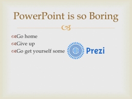 I sometimes get asked what I think about Prezi. My answer usually goes something like, “Well, I think it’s a powerful app that can do some pretty interesting things. But I think most people don’t use it very well.”